Data visualization plays a crucial role in conveying information effectively, aiding in understanding trends, patterns, and relationships within datasets. Among the various forms of data representation, charts and graphs often utilize rectangles to visually represent data points and values. This article explores the significance of using rectangles in charts, their types, advantages, and how they enhance data interpretation across different fields.
Importance of Rectangles in Data Charts
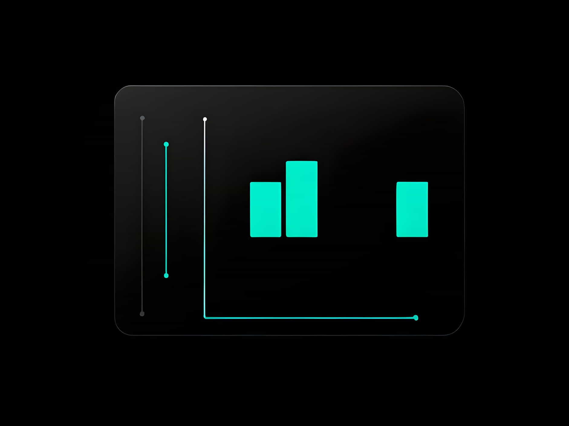
1. Visual Clarity and Comparison:
Rectangles in charts, such as bar charts and histograms, provide a clear and structured way to represent numerical data. Each rectangle’s length or area directly correlates with the value it represents, allowing for easy comparison between different categories or data points.
2. Categorical Representation:
Bar charts, for example, use rectangles to represent categorical data. Each rectangle (bar) is aligned along one axis (usually the x-axis) and varies in height based on the corresponding data value, making it simple to compare values across categories.
3. Quantitative Analysis:
Rectangles in charts enable quantitative analysis by visually encoding numerical data into discrete units (length, area, etc.), facilitating quick comprehension of trends, distributions, and outliers within datasets.
Types of Charts Using Rectangles
1. Bar Charts:
Bar charts use rectangular bars to represent data values for different categories. The height of each bar corresponds to the data value it represents, providing a straightforward visual comparison tool.
2. Histograms:
Histograms utilize rectangles to display the distribution of continuous data by grouping data into intervals (bins). The width of each rectangle represents the interval width, while the height indicates the frequency or count of data points within that interval.
3. Stacked Bar Charts:
Stacked bar charts use multiple rectangles stacked on top of each other within each category to show the contribution of different sub-categories to the total. This format helps visualize both individual values and their composition within larger categories.
4. Pictograms:
Pictograms use small, proportional rectangles (or icons) to represent quantities or percentages of a whole. Each rectangle’s size corresponds to the data it represents, offering a visual representation that is intuitive and easy to interpret.
Advantages of Using Rectangles in Charts
1. Visual Hierarchy:
Rectangles create a clear visual hierarchy in charts, allowing viewers to easily identify and focus on important data points or trends within complex datasets.
2. Simplicity and Accessibility:
Charts using rectangles are generally straightforward to interpret, making them accessible to a wide range of audiences, including those without specialized data analysis skills.
3. Effective Communication:
Rectangles in charts facilitate effective communication of data insights by emphasizing comparisons, trends, and distributions in a visually appealing and structured format.
Enhancing Data Interpretation
1. Color Coding:
Color can be used effectively with rectangles in charts to distinguish between different categories, highlight trends, or emphasize specific data points, enhancing visual clarity and interpretation.
2. Interactive Features:
Interactive charts with hover-over effects or drill-down capabilities allow users to explore data represented by rectangles more dynamically, gaining deeper insights and understanding.
3. Contextual Information:
Providing contextual information, such as axis labels, legends, and annotations, alongside rectangles in charts, helps clarify the data’s significance and improves overall comprehension.
Applications Across Industries
1. Business and Finance:
Bar charts are widely used in business and finance to visualize sales data, market trends, and financial performance metrics, aiding decision-making and strategic planning.
2. Healthcare and Research:
Histograms are employed in healthcare and research settings to analyze patient data, medical test results, and scientific experiments, facilitating data-driven insights and discoveries.
3. Education and Academia:
Educational institutions use pictograms and bar charts to illustrate statistical data, survey results, and educational outcomes, making complex information more accessible and engaging.
In conclusion, rectangles play a pivotal role in data visualization through charts, enhancing the clarity, accessibility, and interpretability of numerical data across various fields. Whether representing categorical data in bar charts, depicting distributions in histograms, or visualizing proportions in pictograms, rectangles provide a visual framework that facilitates meaningful insights and informed decision-making. By understanding the significance of rectangles in charts and their applications, individuals and organizations can effectively communicate data-driven narratives, explore patterns, and uncover valuable insights that drive innovation and progress in diverse domains.